
The Problem
They had good products and loyal customers — but a brand stuck in beauty limbo.
Too raw for “clean beauty,” too soft to stand out. Their visuals were bland, their voice barely a whisper, and their site? Just... there.
Nothing was stopping the scroll.
The Webliz Glow-Up
We helped them throw out the rulebook and own their edge.
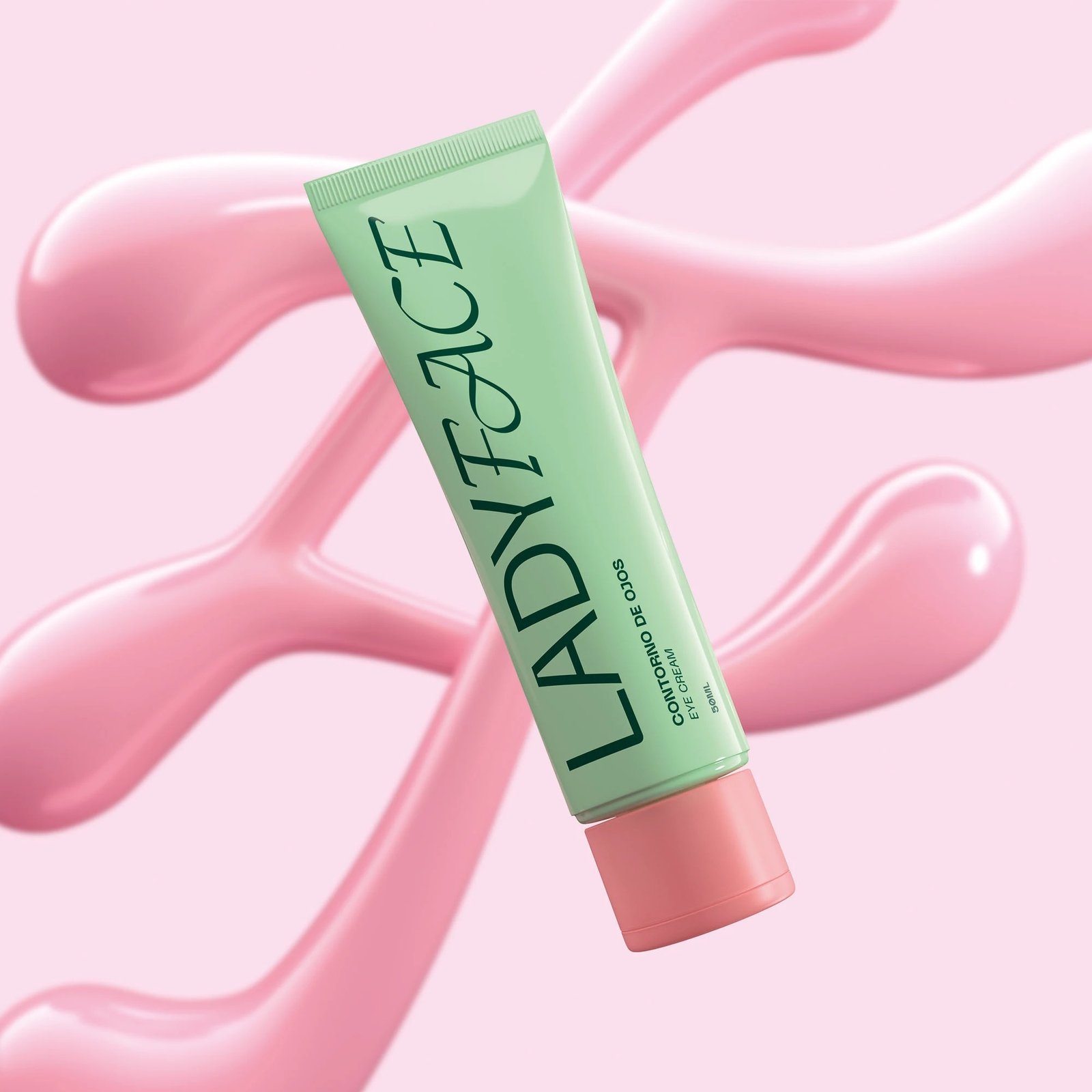
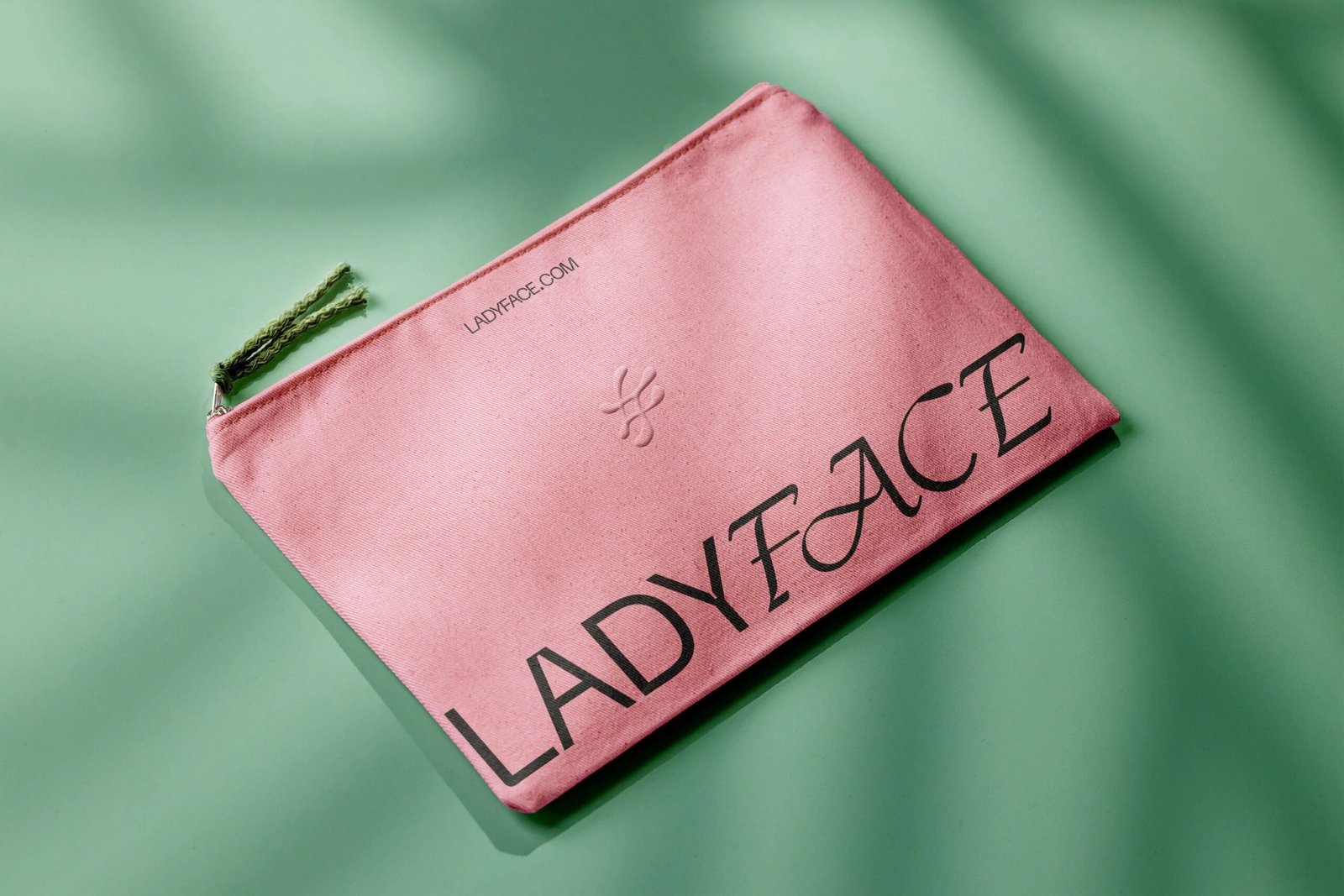
Logo: Gritty, dripping type that looked like it was smudged with lipstick and attitude
Website: A neon-drenched Shopify storefront with bold motion, unapologetic copy, and visuals that felt more punk than polished
Social: Swapped pastel filters for raw shots, bold swatches, fire captions, and product drops that caused chaos