
The Problem
They had premium product — strong, bold, unforgettable.
But their brand? Soft. Generic. Giving brunch cafe with pastel fonts and zero edge.
It didn’t look like it belonged in the hands of a rebel — and that’s who they were brewing for.
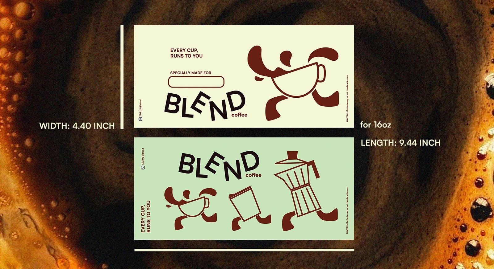
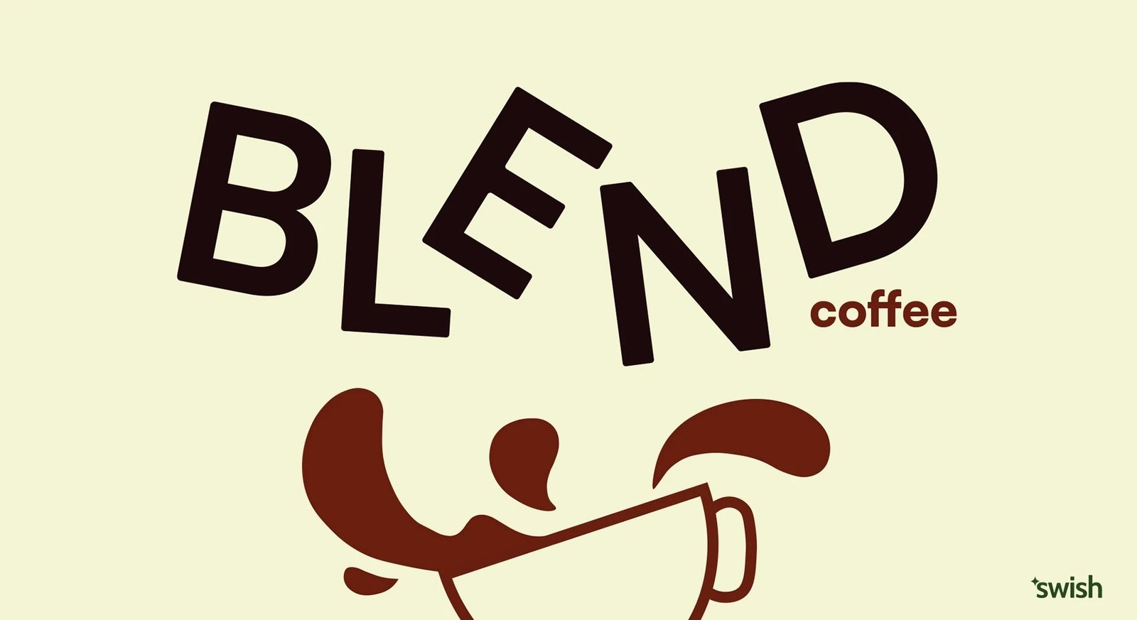
Webliz Treatment
We threw the beige in the bin and brewed something with bite.
Logo: Brutalist-inspired, sharp-lined, caffeine-coded chaos — a visual slap in the face
Website: One-page glitch-fueled experience that moves fast and hits hard
Social: Zero filters, all fire — bold typography, chaos-laced memes, and scroll-stopping drops